Northport Investments
Web Design & Branding
Project Overview
Northport Investments looks for only the most unique investment opportunities for their clients. This uniqueness in there offerings was a concept they wanted to see reflected in their brand. They were looking to update and modernize there brand identity with a more timeless, forward thinking look and feel.
The overall goals of this project were to create a timeless, warm, and inviting brand identity and web site for this private equity investment firm.
The Challenge
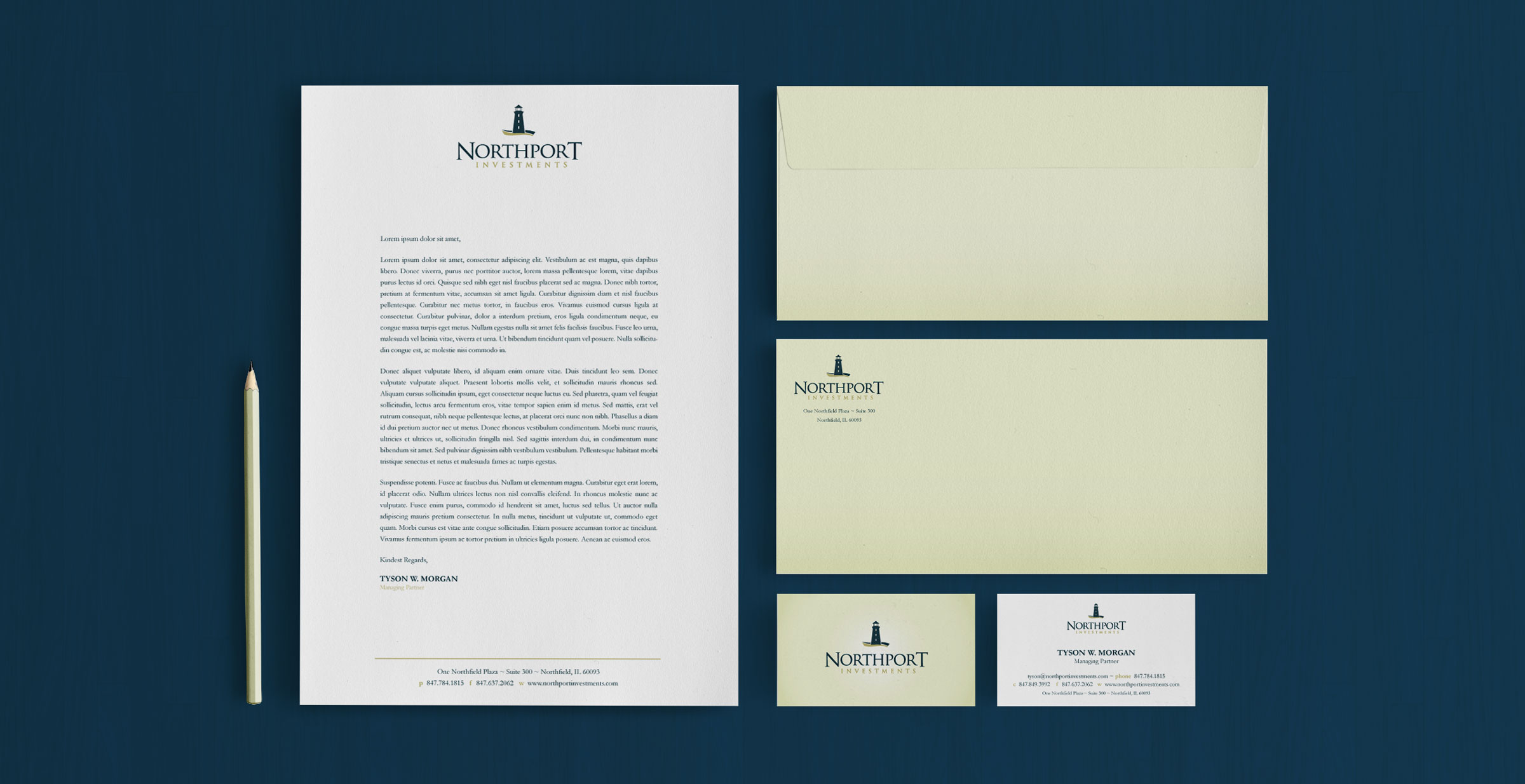
The challenge was to create a new lighthouse mark that incorporated the idea of hi-end investments/luxury and trustworthy service through the "guiding force" symbolism of the lighthouse in a clean, professional way. After digitally experimenting with numerous layouts and style treatments of a lighthouses on the ground to reinforce the concept of stability with waves a mark was chosen that reflected all the values they expected. The 3 windows are suppose to represent the 3 founding principals of the Company.
The color palette chosen of the dark sea greens, navy, and light golds was meant to give Northport a hi-end, professional, and trustworthy feel and to reinforce the nautical theme of the logo itself.
Details
- Designed in 2011
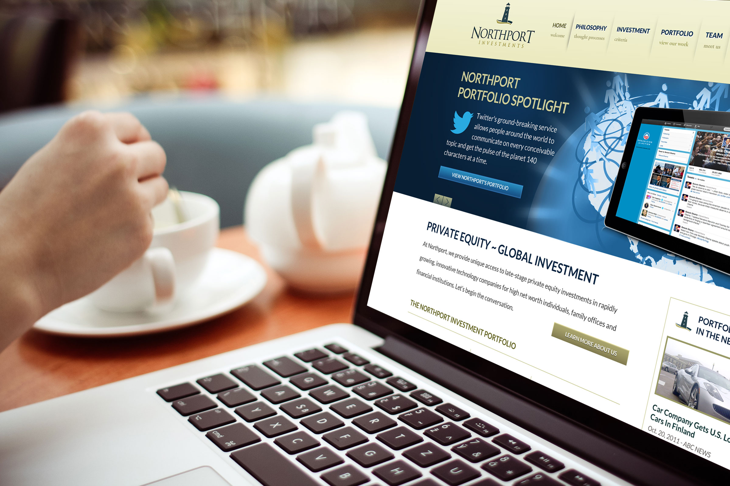
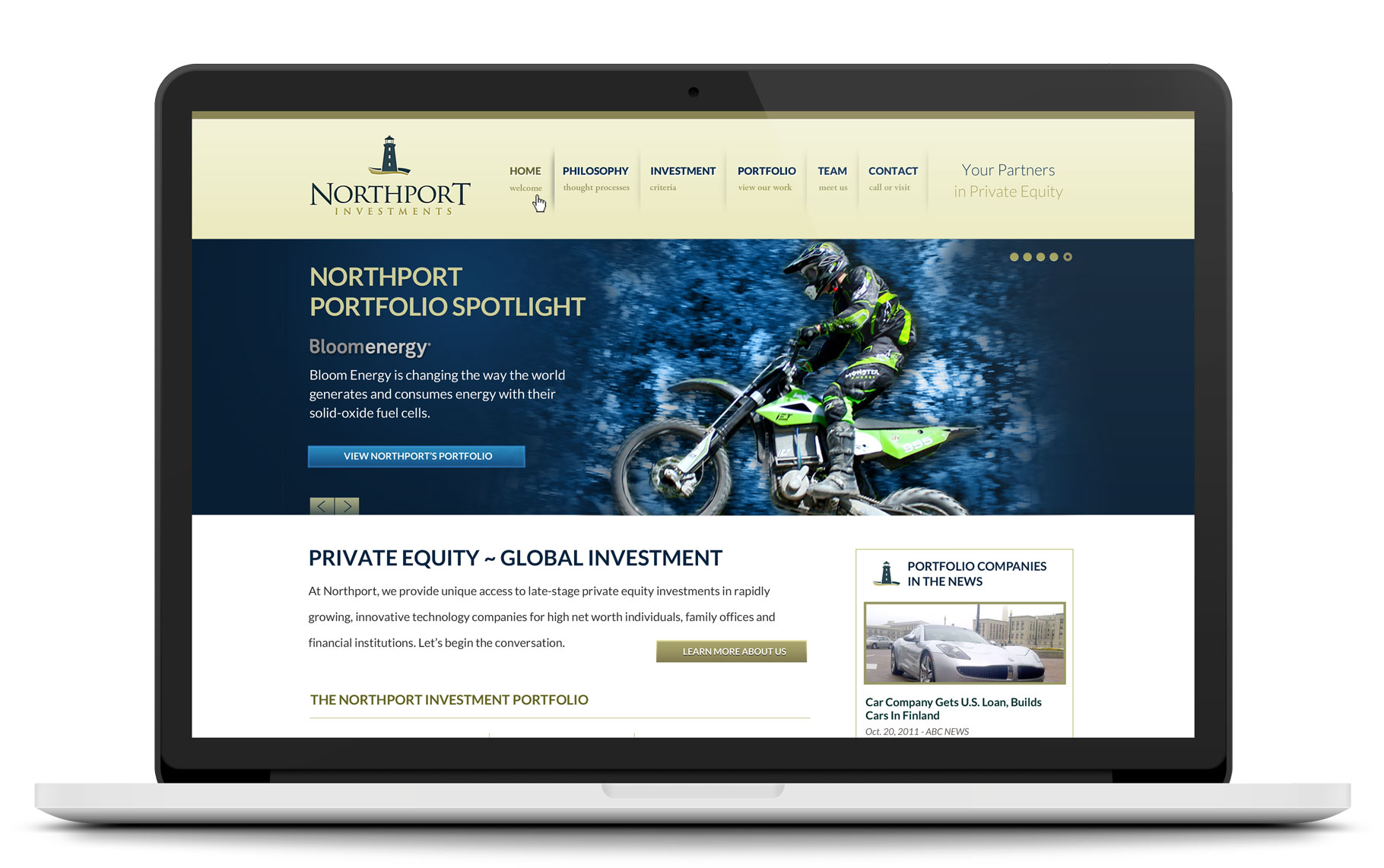
- Branding Identity pieces designed included logo, business cards, letterhead, envelope, and desktop web site design.
Like What You See?
Get In Touch